A curated collection of calm and light — made to elevate your space
The Psychology of Color: Why Natural Tones Calm Us
Discover how natural hues—greens, blues, and earth tones—reduce stress, slow your heart rate, and create calm in your home, backed by scientific research.
Angela Moiseieva
7/25/20252 min read
You might not notice it day‑to‑day, but color shapes how we feel. Bold reds wake us up. Dark blacks demand attention. Yet the soft greens of a forest, the pale blues of the sky, and the warm beiges of sun‑bleached sand do something quieter—they help us relax.
In multiple studies, researchers have found that colors you see in nature—soft greens, gentle blues, warm browns—actually slow your heart and lower stress. For example, Roger Ulrich’s classic 1984 experiment showed hospital patients who looked at tree‑filled scenes recovered faster and had lower blood pressure than those staring at brick walls. Modern design psychologists have since confirmed the same effect in living rooms and offices: a nature‑inspired palette helps your mind feel clearer and more at ease.
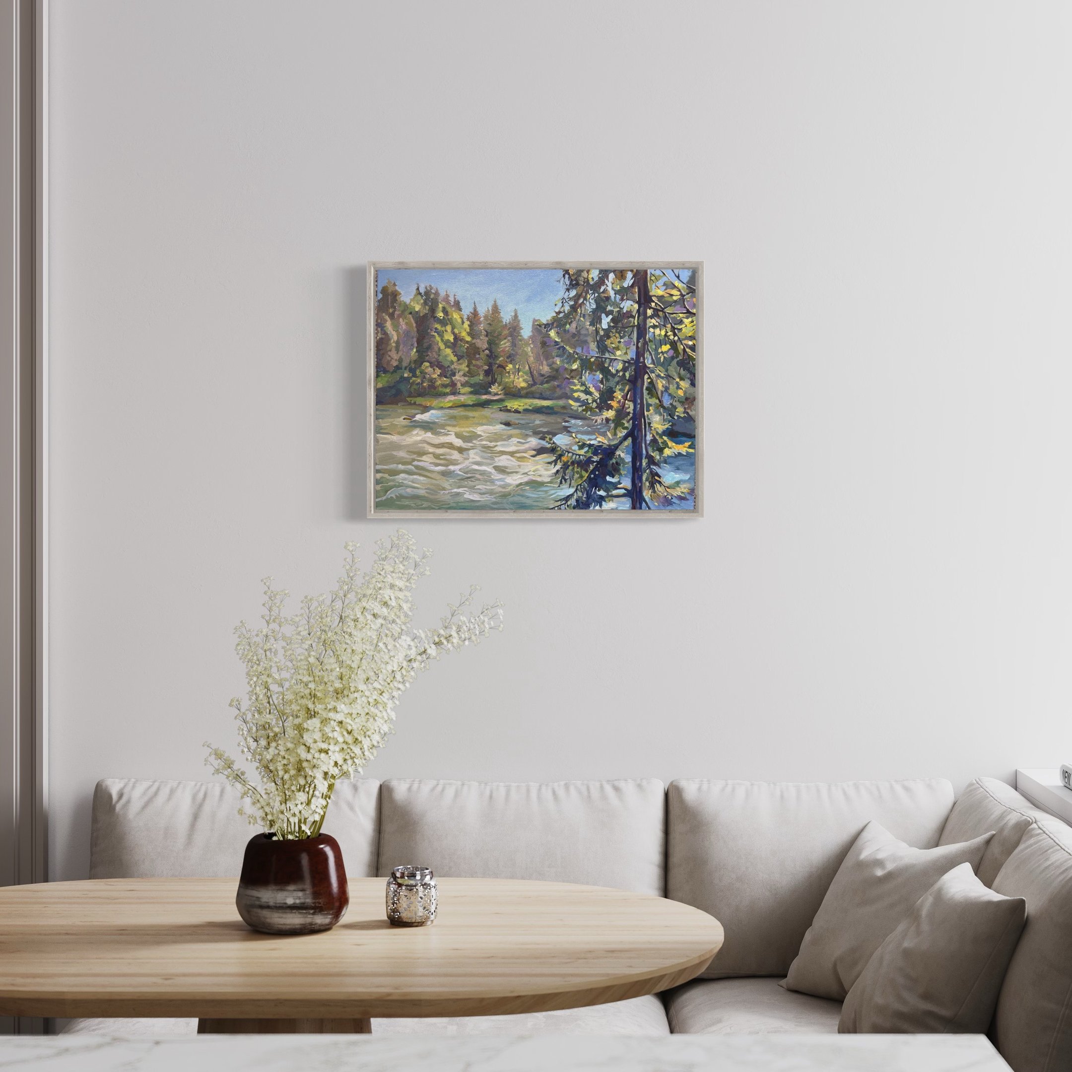
Over the past ten years, interior style has gone “quiet neutral”—think whites, creams, and soft grays. That makes sense: in our over‑stimulated world, simple colors soothe. But plain isn’t always powerful. A neutral room needs a “soul point,” a visual anchor. That’s where an original painting in natural tones can shine: it brings in a real piece of the outdoors that speaks to your emotions.
When you hang an original artwork painted in mindful brushstrokes and genuine earth pigments, it does more than fill empty wall space. It reconnects you to those steady moments outdoors—walking through a dew‑drenched forest, watching light play on a lake at dawn. That lived‑in feeling translates into a calm mind and room.
“Calm” doesn’t have to mean “colorless.” Nature gives us perfect examples:
Golden fields at sunset glow with gentle warmth.
Deep green pines dappled in sunlight feel alive yet peaceful.
Clear blue skies with hints of soft orange remind us of hope.
A well‑composed painting blends these tones, grounding your space while still inviting energy.
At the same time, vibrant accents can spark joy. A single stroke of crimson, a dash of sunflower yellow, or a splash of cobalt blue can lift a quiet room into something memorable. In my work, I often layer calm, neutral bases with a hint of something bold—because sometimes, the most soothing statement is a single bright note.
If you’re craving a little more peace in your daily life, let color guide you. An original painting in the hues that move you can be the simplest—and yet most powerful—way to transform your space.
Moiseieva Studio
Original fine art, created to preserve a feeling — and to quietly elevate your space.
Studio Email
hello@moiseievastudio.art
© 2026 Moiseieva Studio. All rights reserved. All artworks are protected by copyright.
Based in Raleigh, NC — Shipping worldwide
•
|
•
•
•
•
•
•